Dedicated Mobile App


Responsive Desktop Site


About the Project
Thrifty Nifty is a real time crowd-sourced grocery price comparison app and responsive website. The primary users are everyone that shops in grocery stores and eats at restaurants.
Project Duration:
July 2022 - August 2022
The Problems:
Food Delivery/Pickup Apps
•Paying too much for groceries and meals at restaurants.
•Food ordering apps don’t list price dates/times, so users have to hope prices are accurate.
•They also don't allow users to submit more accurate prices, nor offer both grocery stores and restaurants.
Food Price Reporting Apps
•The apps that offer price reporting lack recent enough prices and vital search filters.
•Price reporting apps don’t offer delivery/pickup options.
The Goal:
Design an app and complementary responsive site that has all the benefits of it's competitors without any of the downsides. Thus offering the best user experience possible.
My Role:
UX Designer designing an app and complementary website for Thrifty Nifty from conception to delivery
Responsibilities:
Conducting interviews, paper and digital wireframing, low and high-fidelity prototyping, conducting usability studies, accounting for accessibility, iterating on desıgns, and putting it all in a case study.
User Research:
I conducted interviews and created empathy maps to understand the users I’m designing for and their needs. A primary user group identified through research was everyone who shops at grocery stores and eats at restaurants.
This user group confirmed initial assumptions about Thrifty Nifty end users, but research also revealed that there were additional needs that needed to be met. Other user needs included additional accessibility, management, and ordering features.
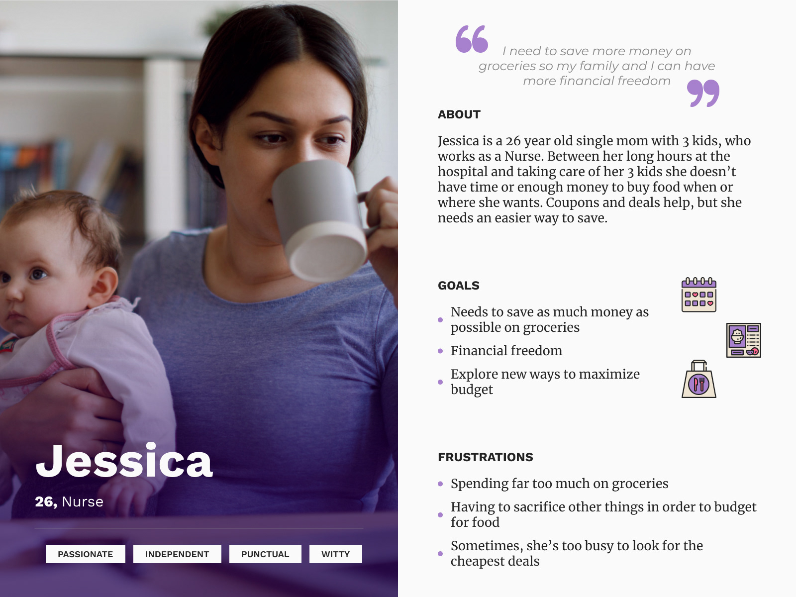
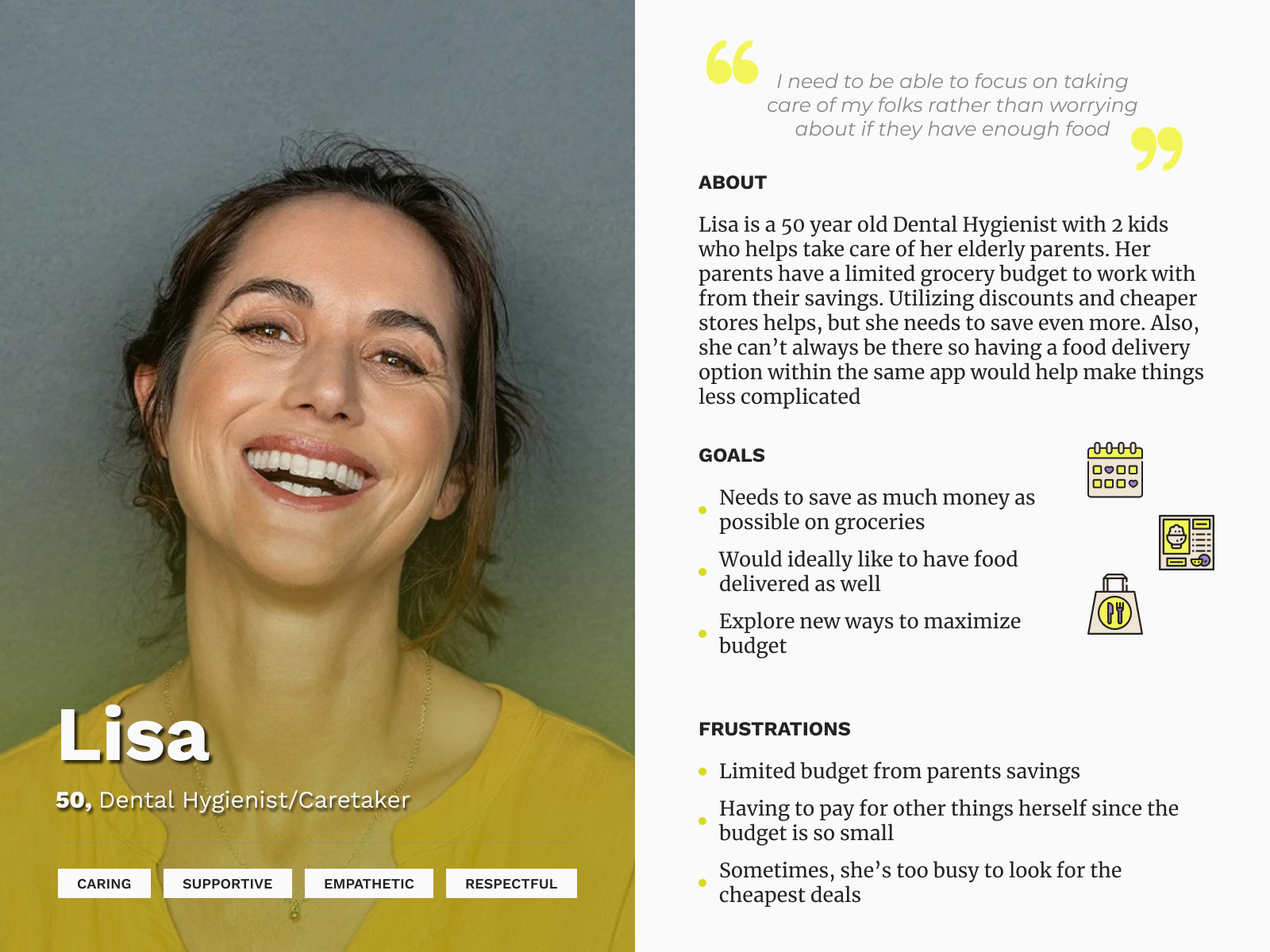
User Personas
Problem Statement: Jessica is a Nurse who needs to save more money on groceries and at restaurants because her family needs more financial freedom.
Problem Statement: Lisa is a Dental Hygienist/Caretaker who needs to save money on groceries and have them delivered because she wastes time she could be taking care of her parents and more of their savings as well.
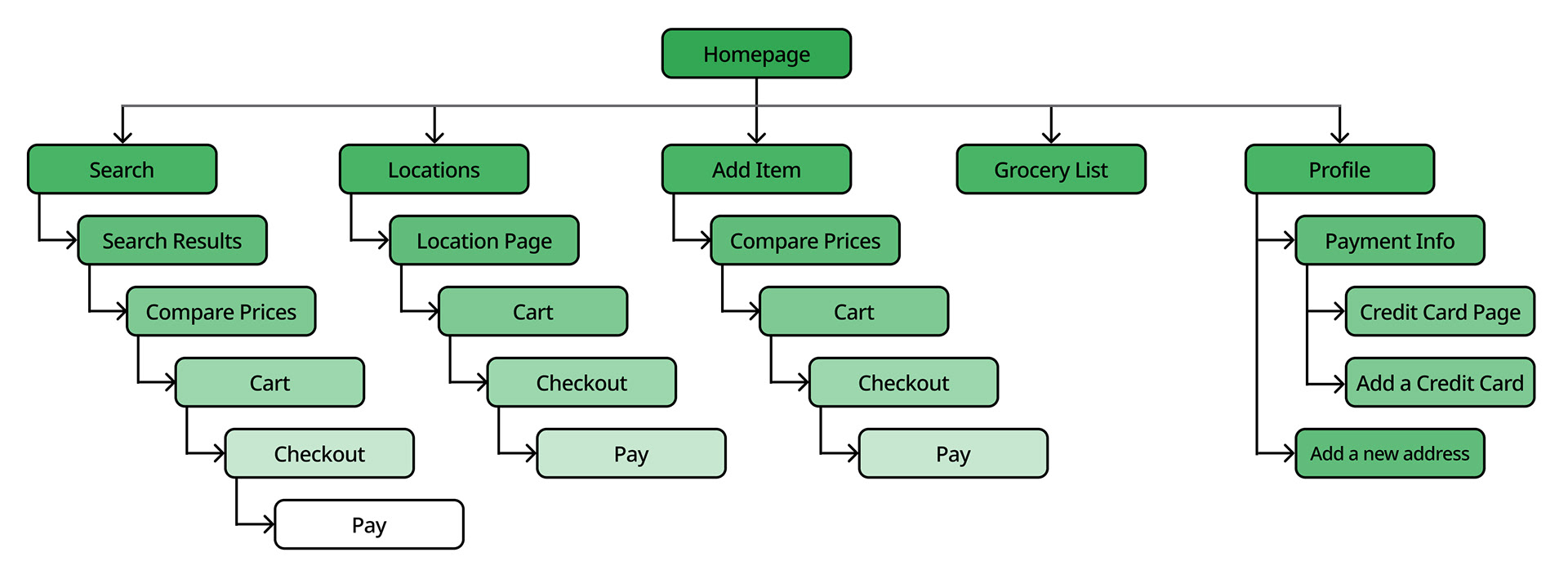
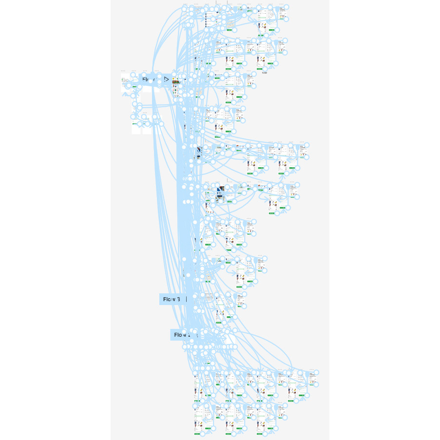
Site Map
My goal was to create an accessible and easy to navigate app/site, as well as simplifying the user flow as much as possible.
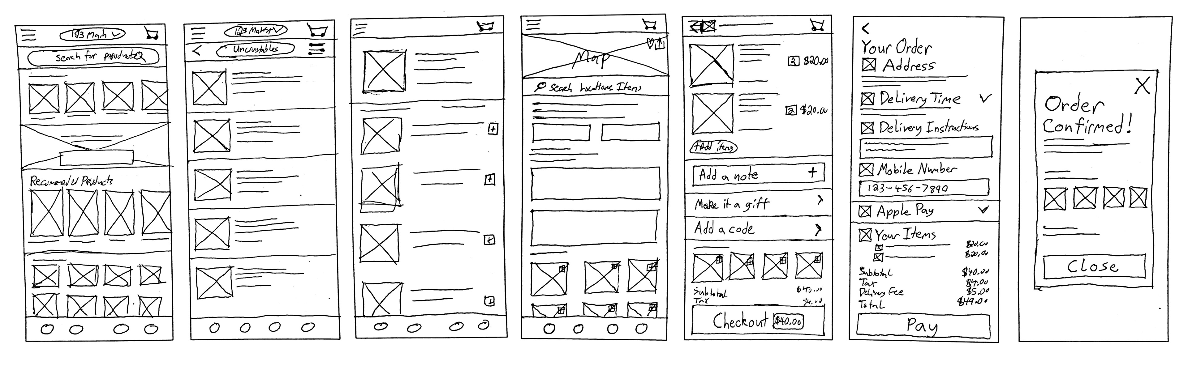
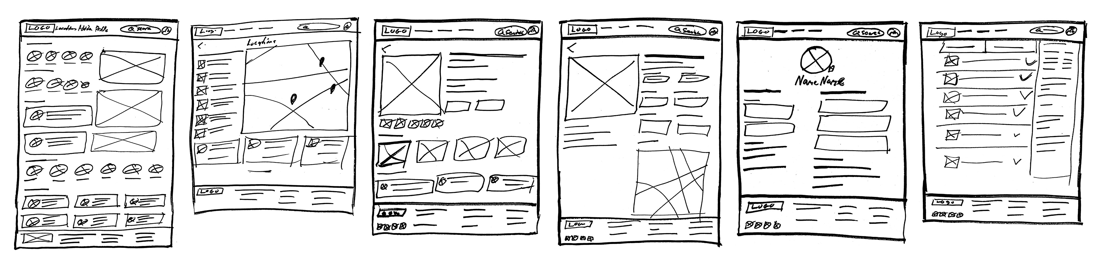
Paper Wireframes
Taking the time to draft iterations of each screen of the app and website on paper ensured that the elements that made it to digital wireframes would be well-suited to address user pain points.
Dedicated Mobile App
Desktop Website
Digital Wireframes
As the initial design started to take shape I made sure to base screen designs on feedback and findings from the user research.
Dedicated Mobile App
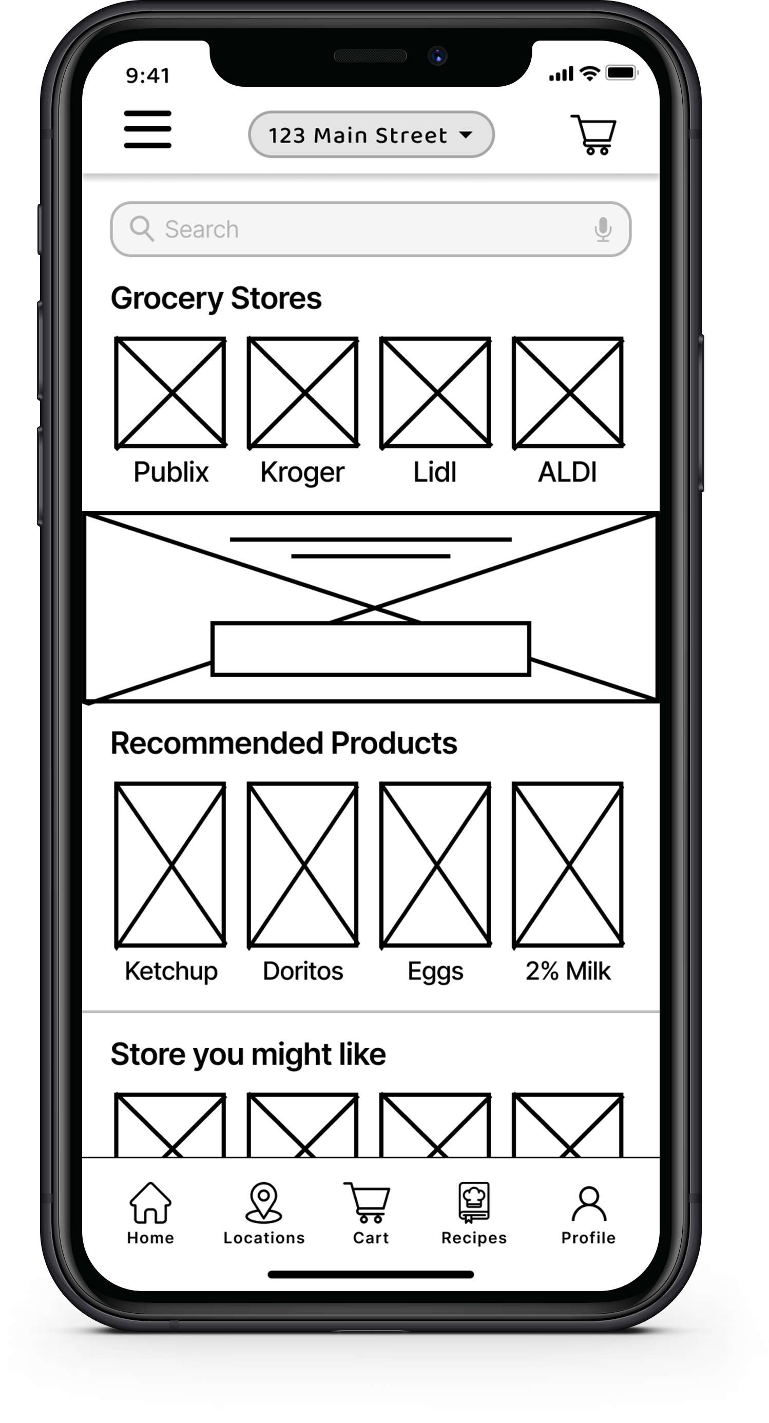
Digital Wireframe for App Homepage
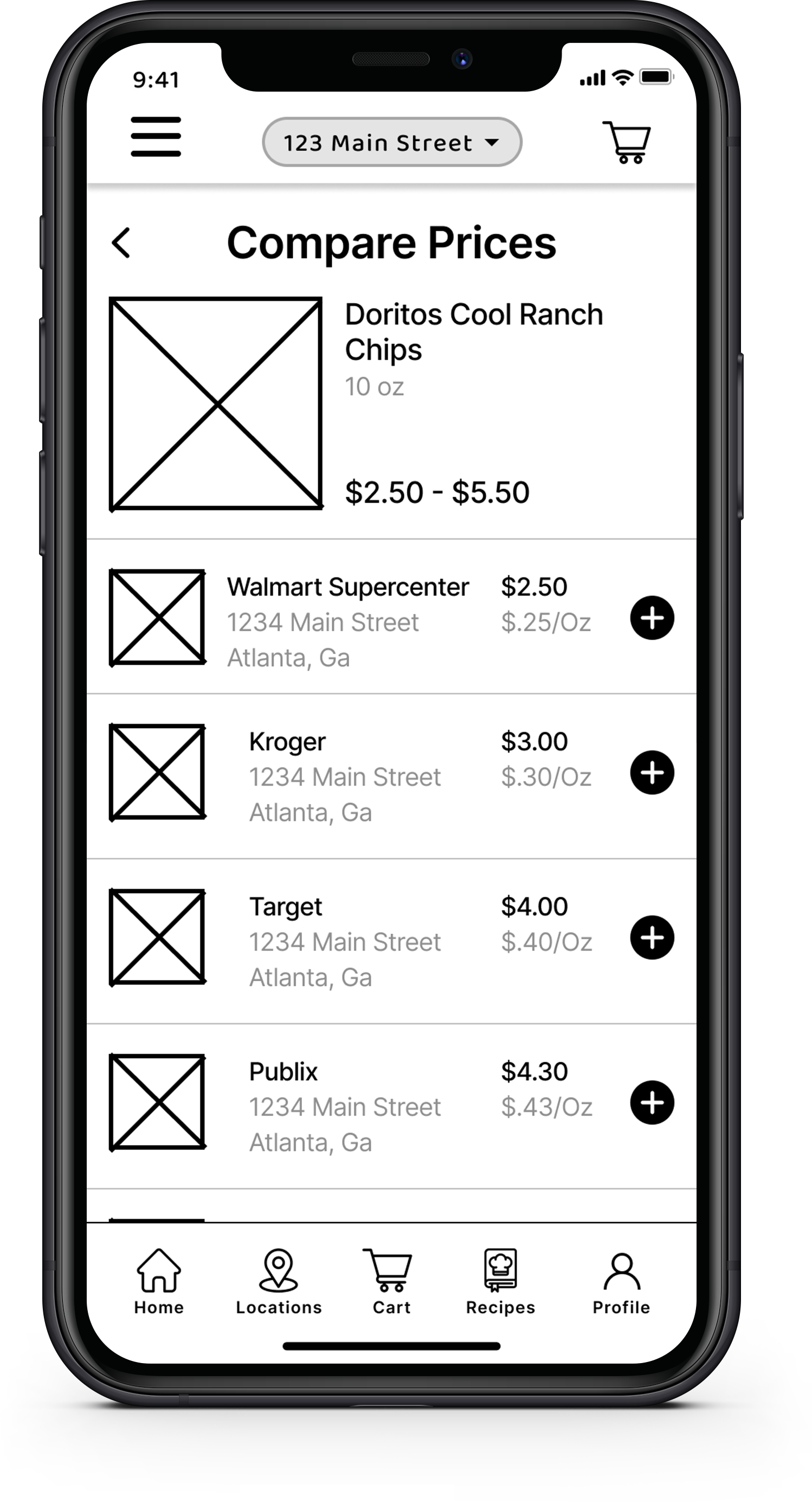
Digital Wireframe for App Compare Prices Page
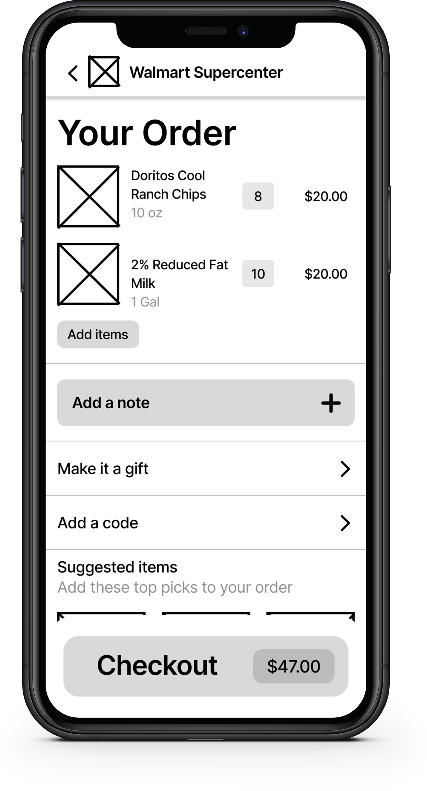
Digital Wireframe for App Cart Page
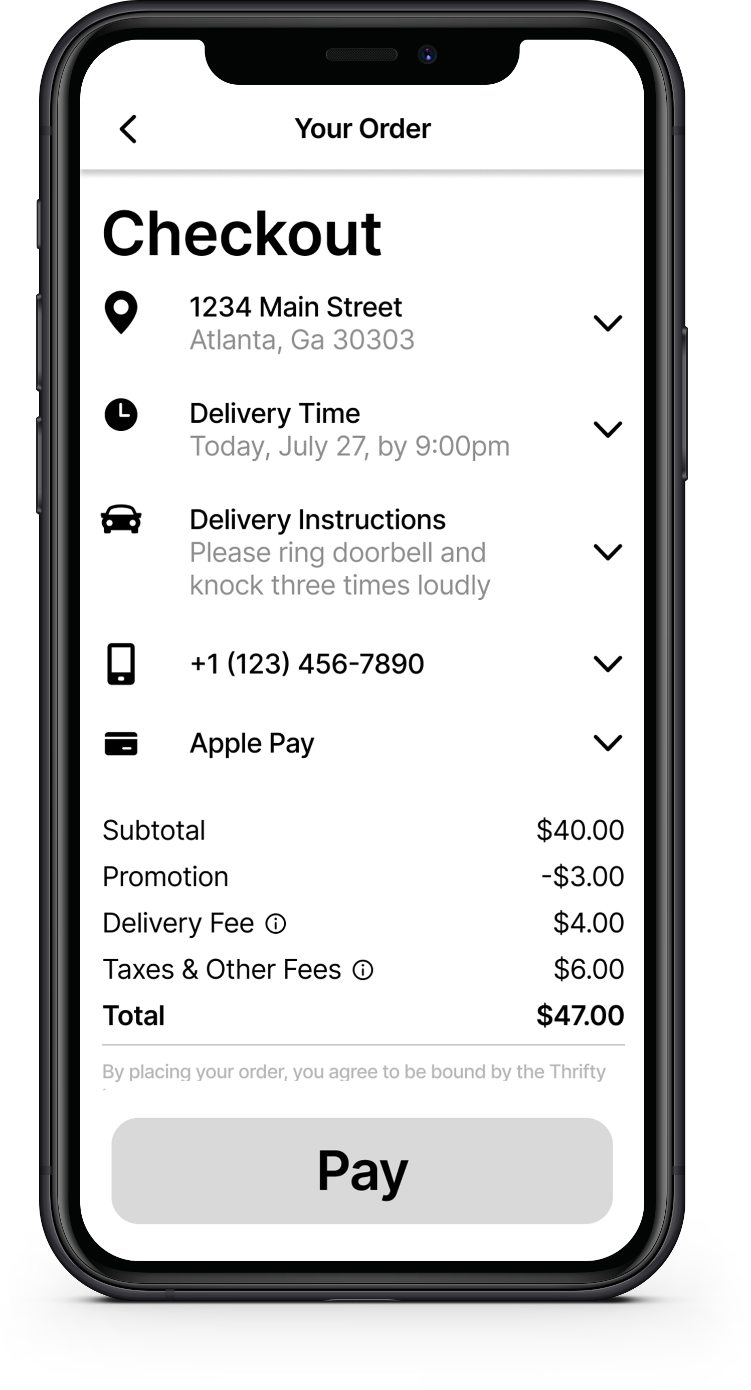
Digital Wireframe for App Checkout Page
Desktop Website
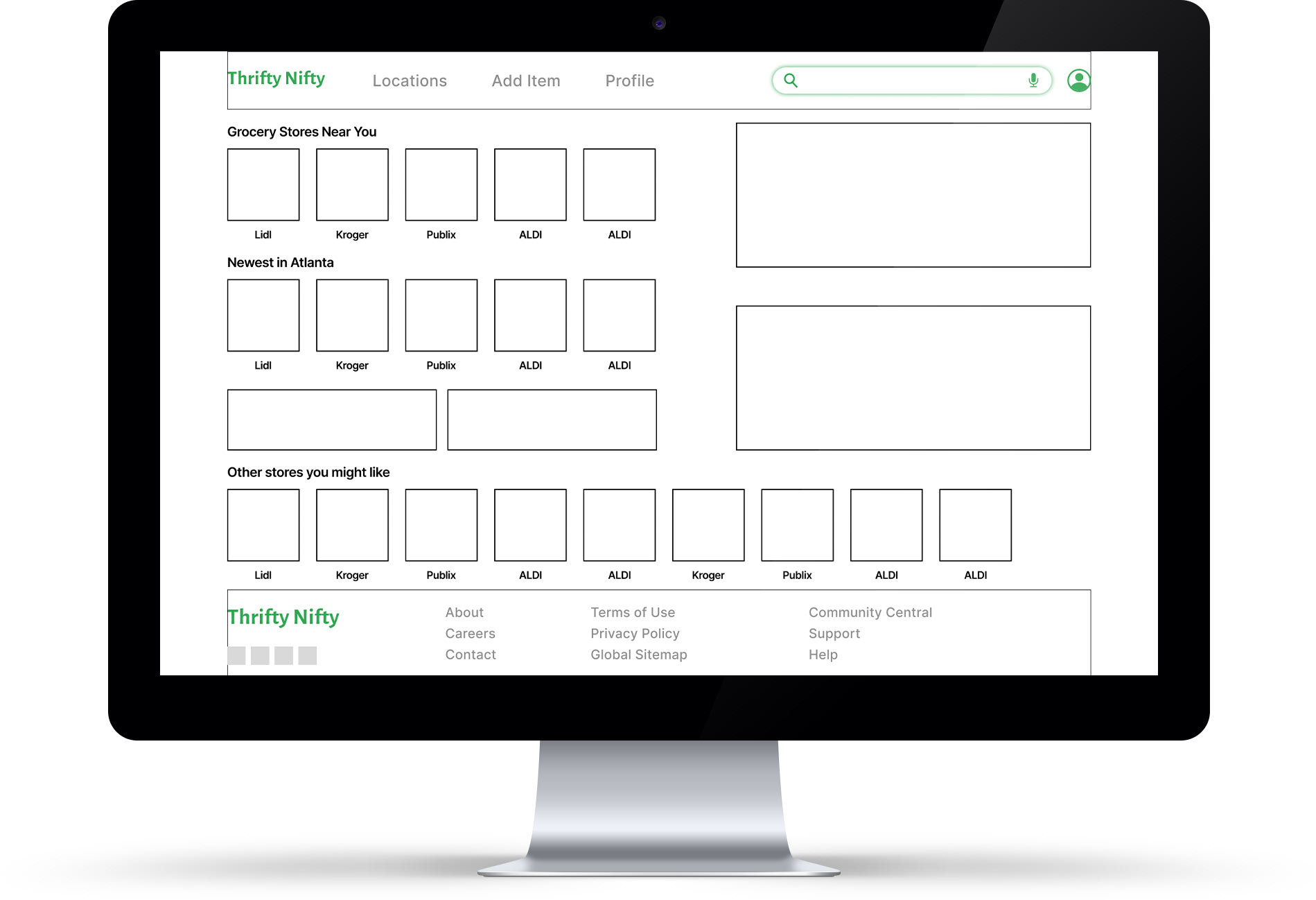
Digital Wireframe for Desktop Homepage
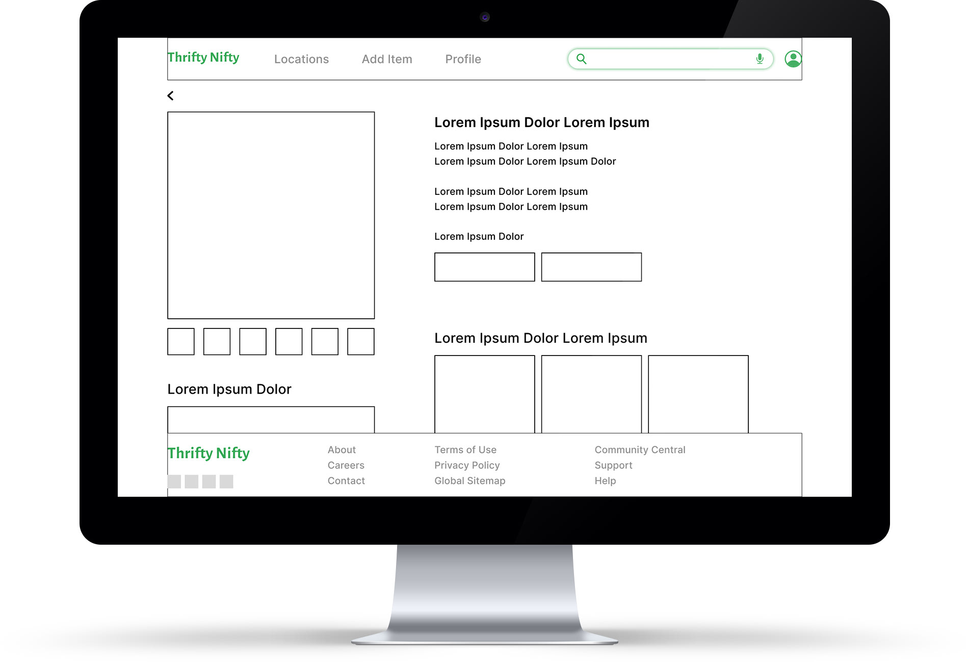
Digital Wireframe for Desktop Price Comparison Page
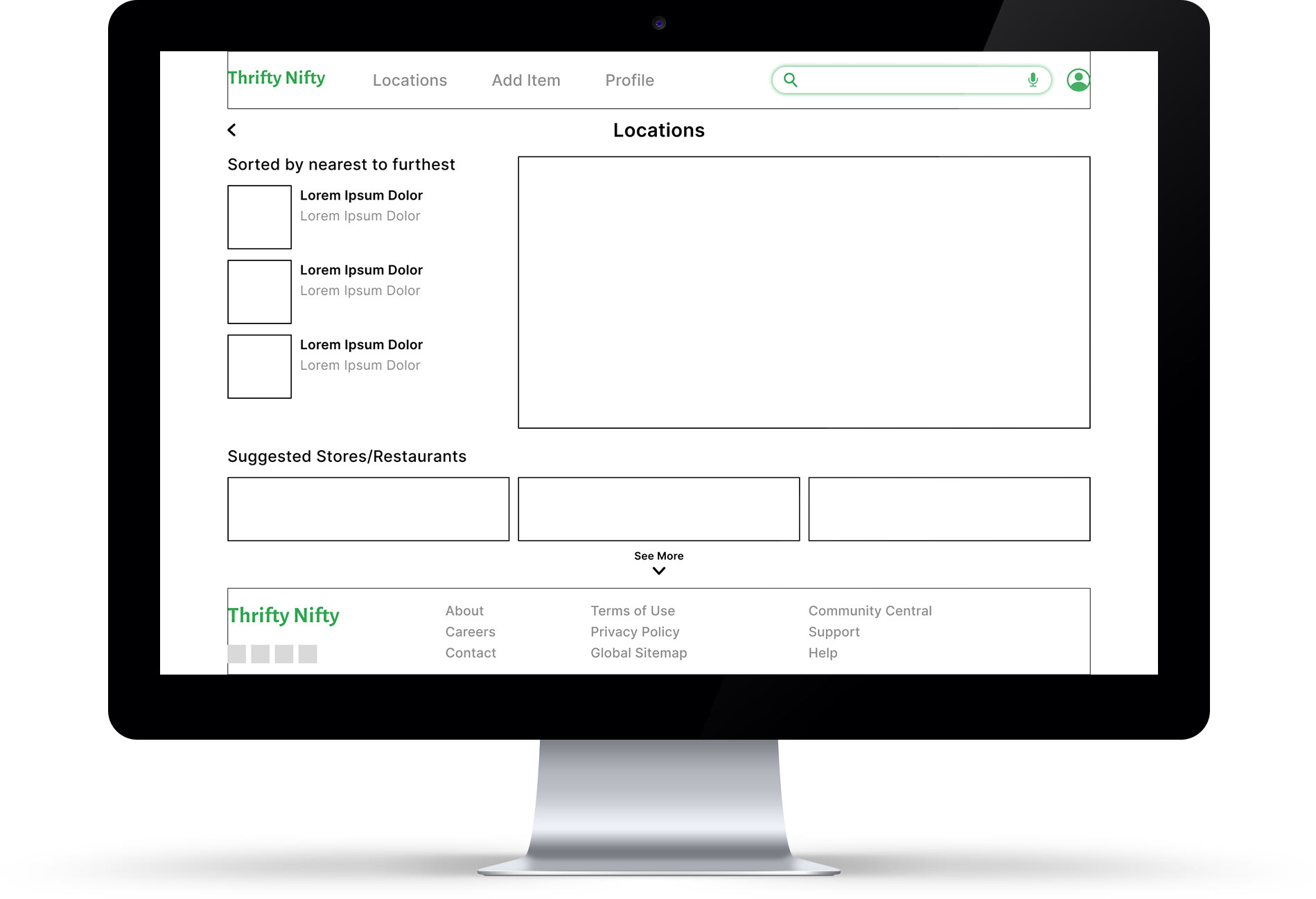
Digital Wireframe for Desktop Locations Page
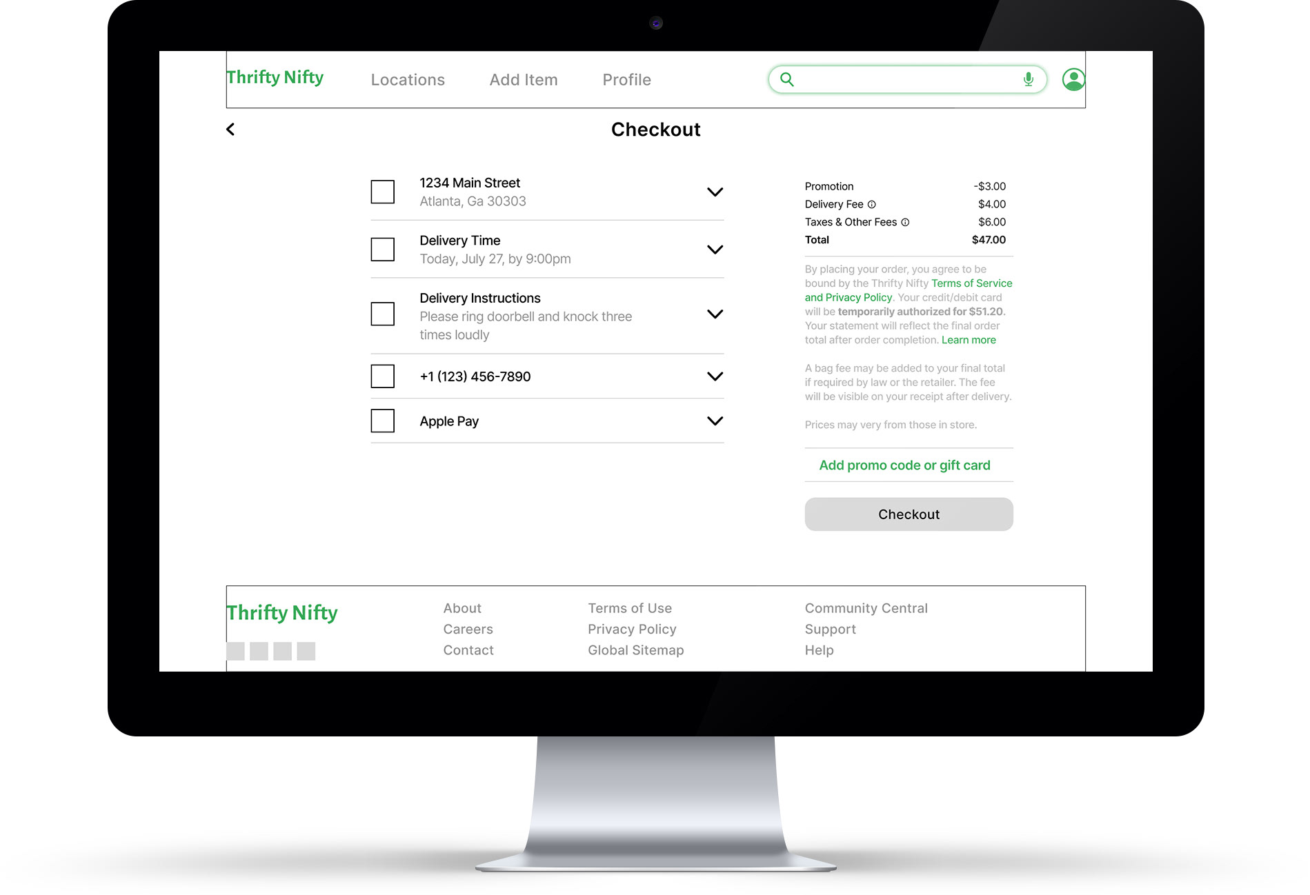
Digital Wireframe for Desktop Checkout Page
Usability Study: Findings
I conducted two rounds of usability studies. Findings from the first study helped guide the designs from wireframes to mockups. The second study used a high-fidelity prototype and revealed what aspects of the mockups needed refining.
Finding #1
Users think it needs to be more obvious how to add/report new prices for an item
Finding #2
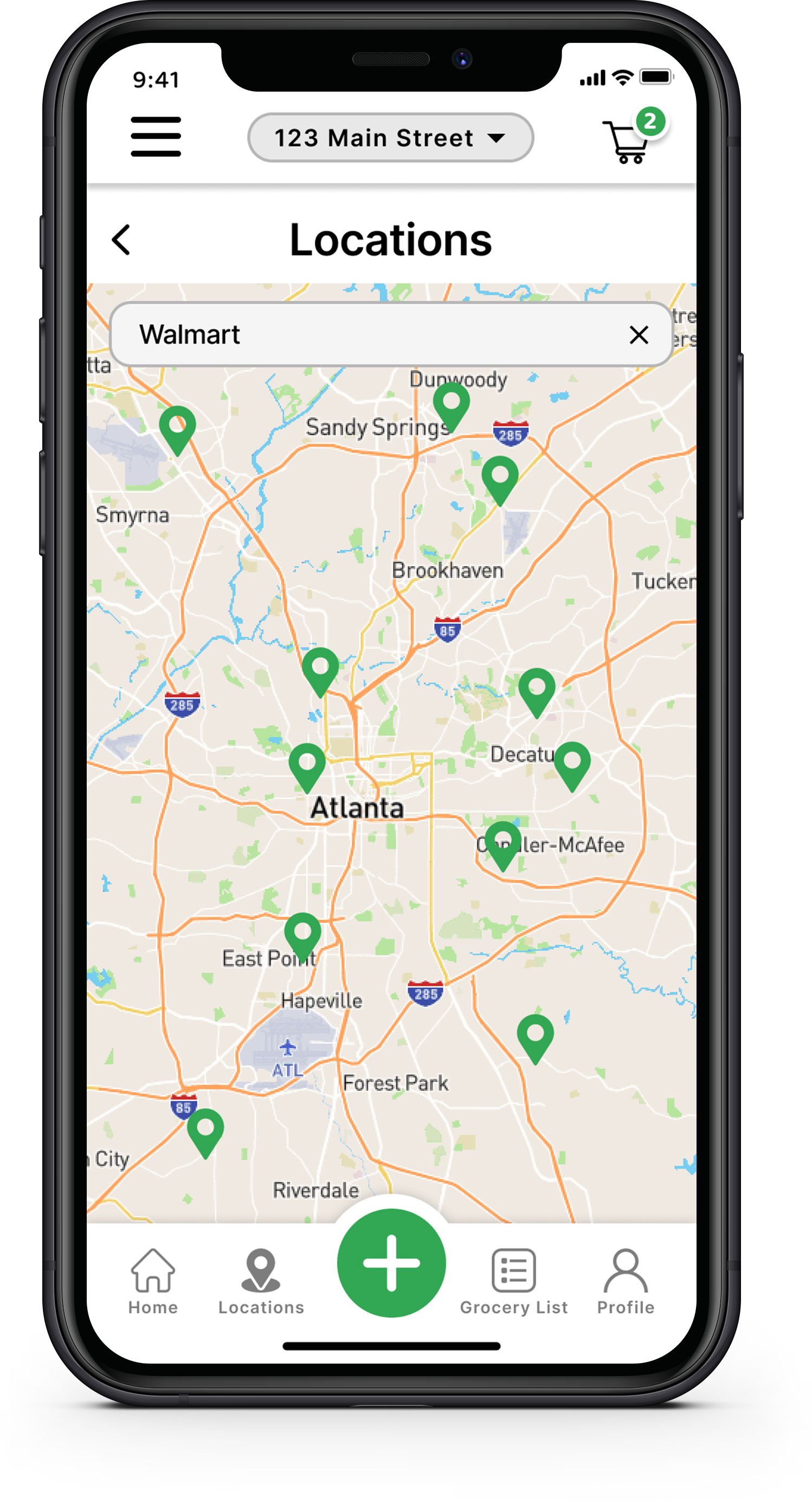
Some users think the store location page needs more features on it
Finding #3
Users made suggestions for additional content throughout the app & site
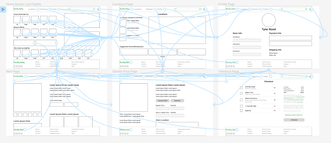
Low Fidelity Prototypes
The low-fidelity prototype connected the primary and secondary user flows of searching and ordering through the app, so the prototype could be used in a usability study with users.
Dedicated Mobile App
Desktop Site
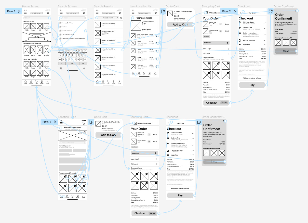
High Fidelity Prototypes
The final high-fidelity prototype has a very complex combination of user flows. This allows for the user to navigate to where they want from wherever they currently are within the app.
Dedicated Mobile App
Desktop Site
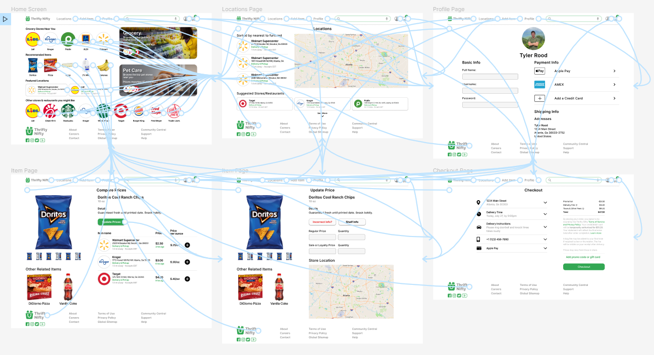
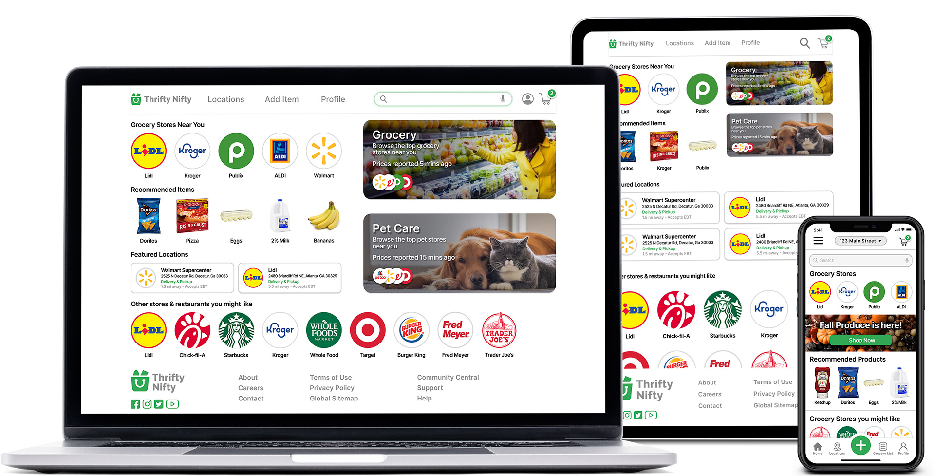
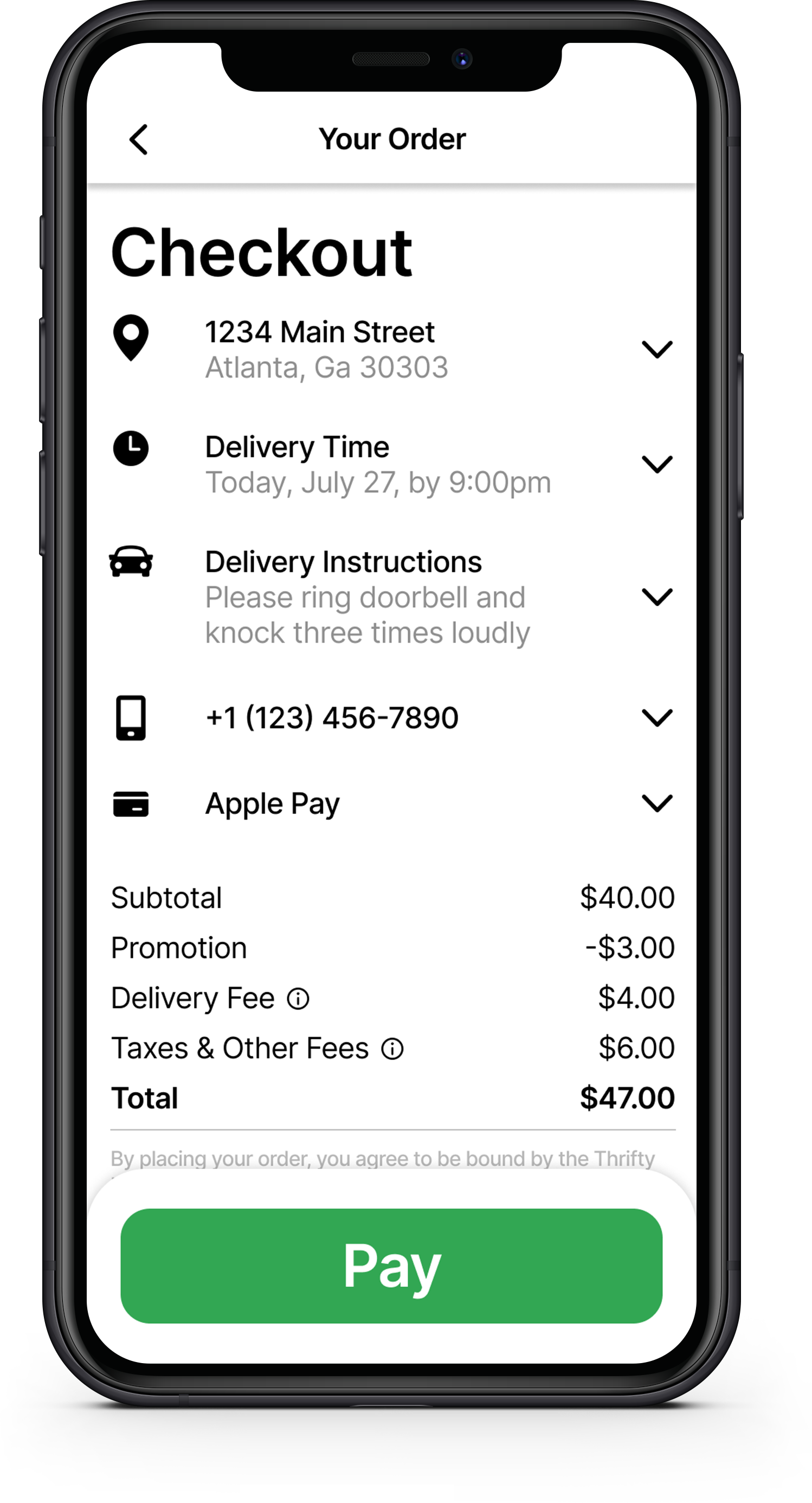
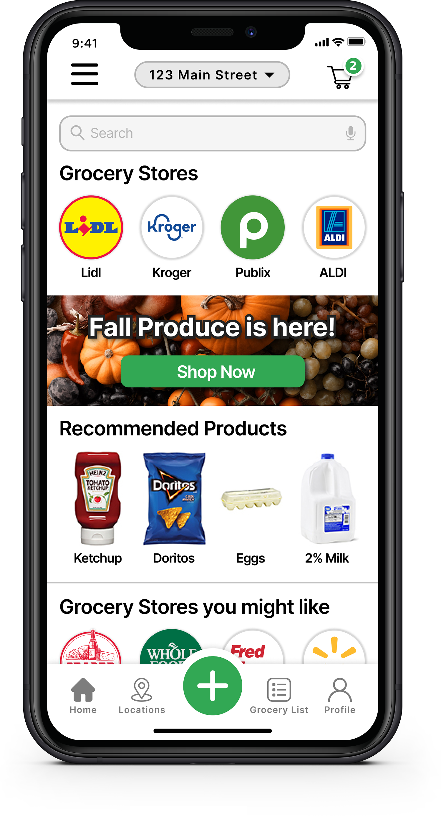
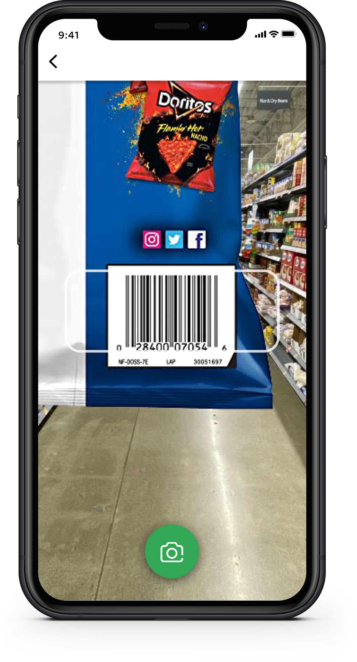
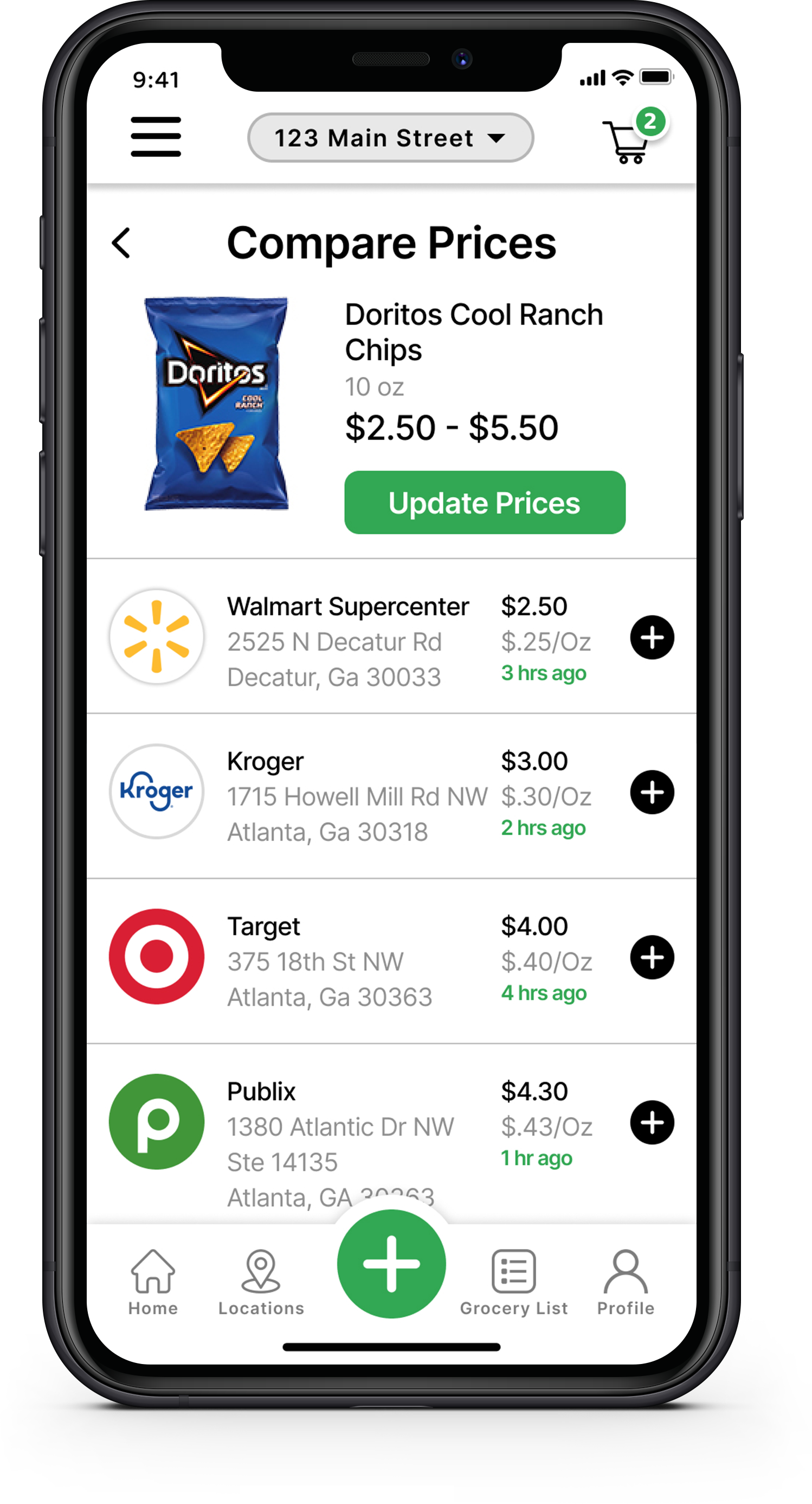
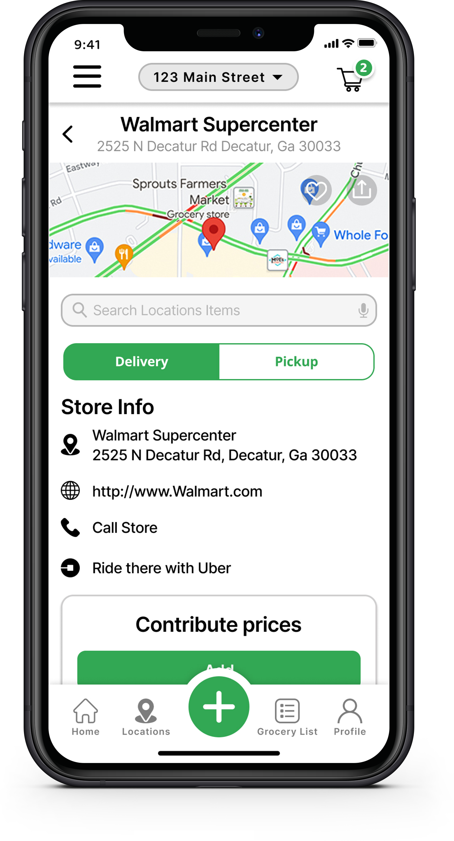
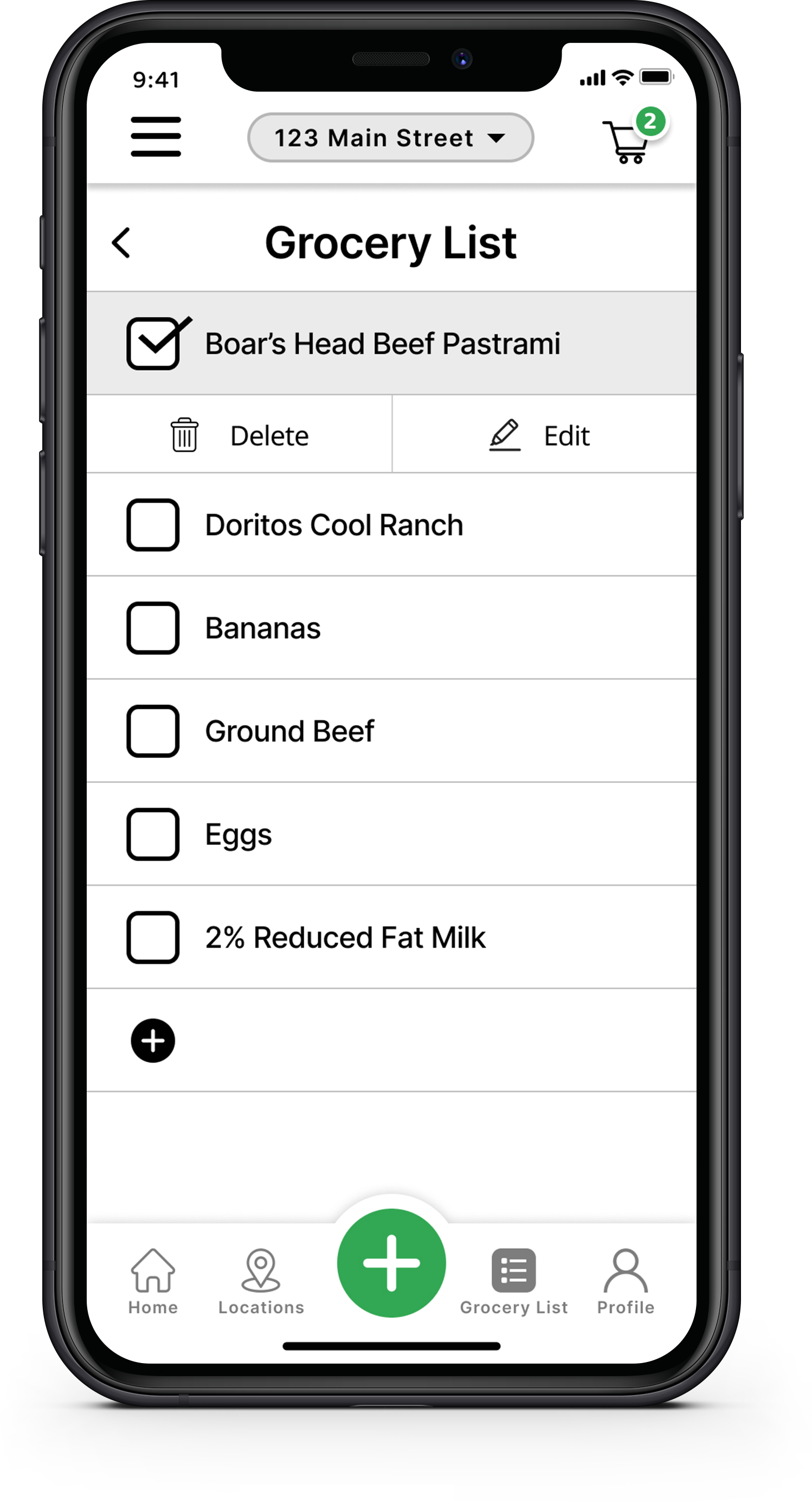
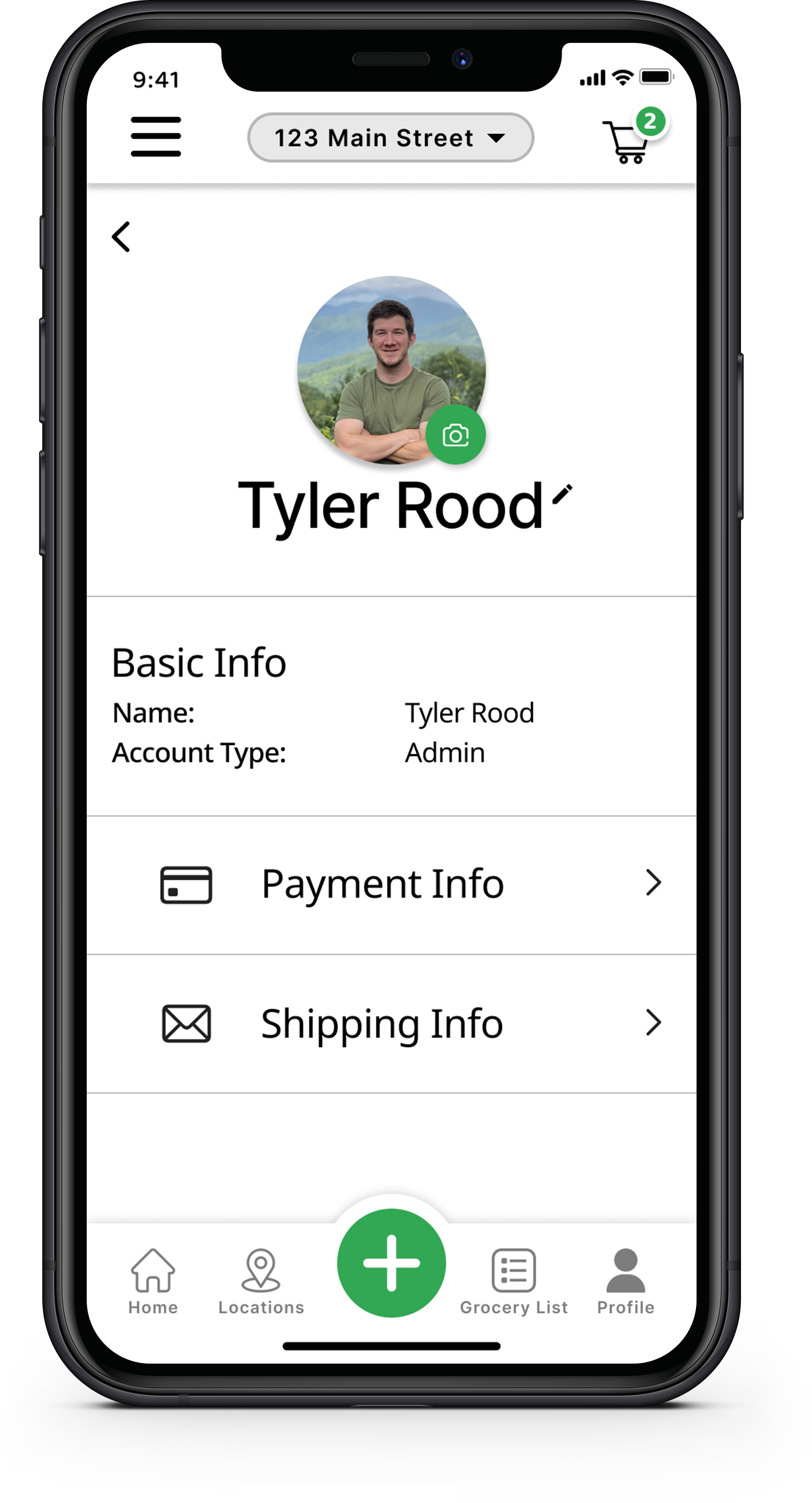
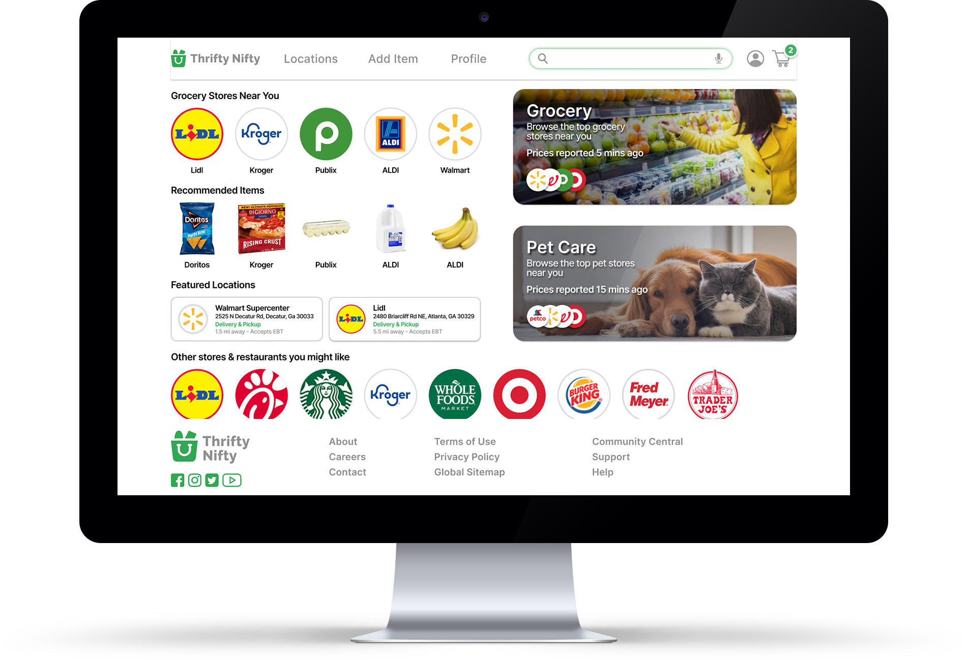
Final Designs
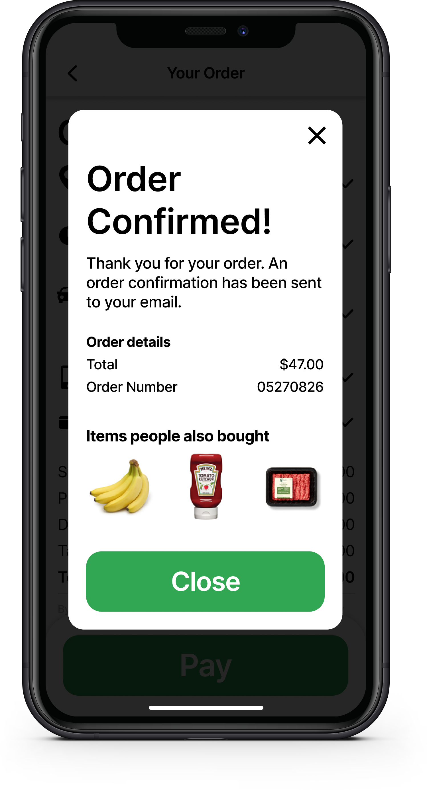
Dedicated Mobile App
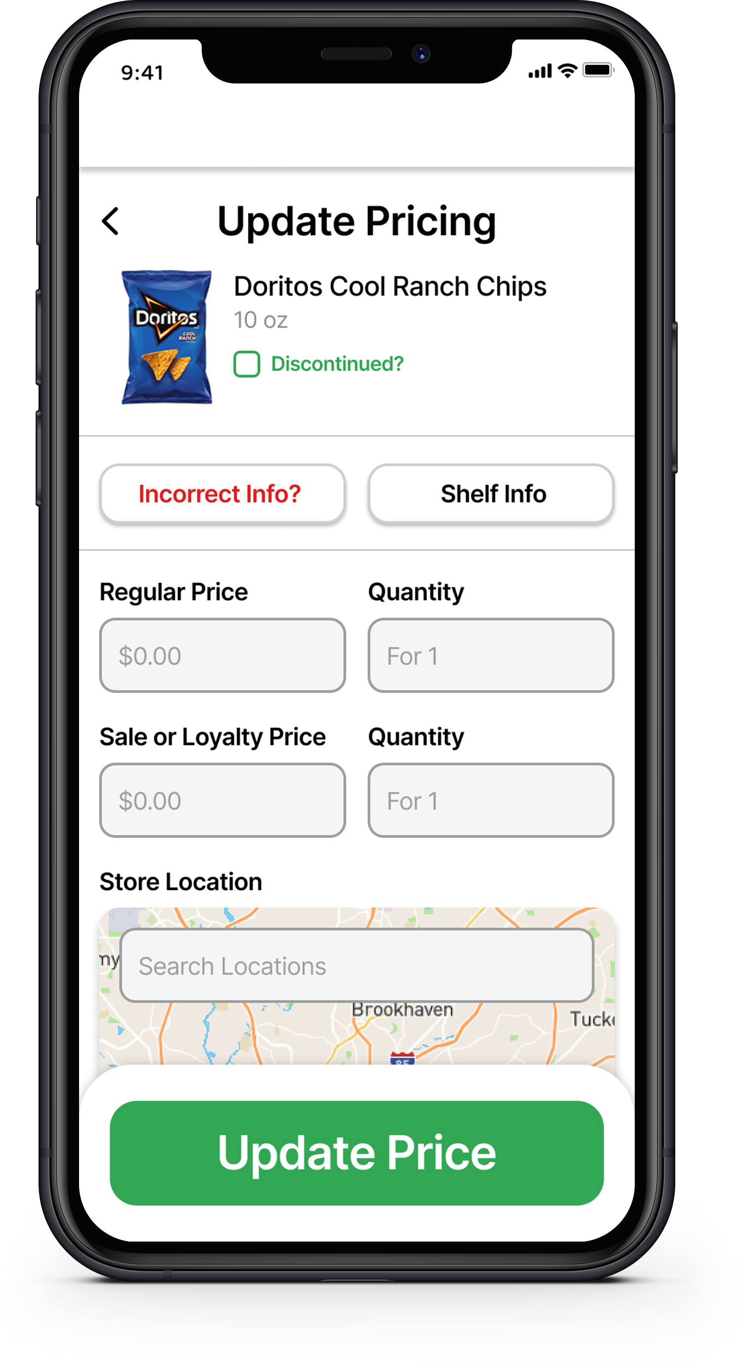
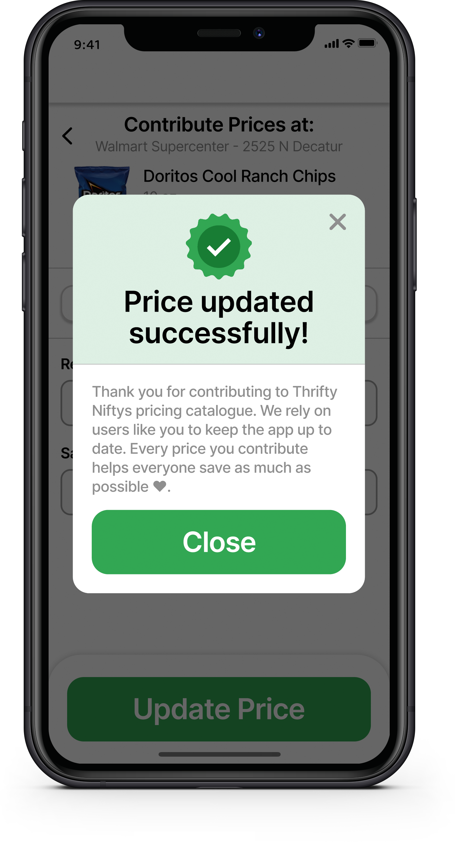
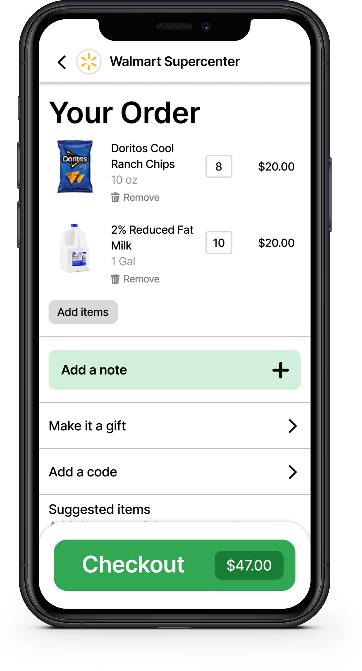
Dedicated Mobile App Continued

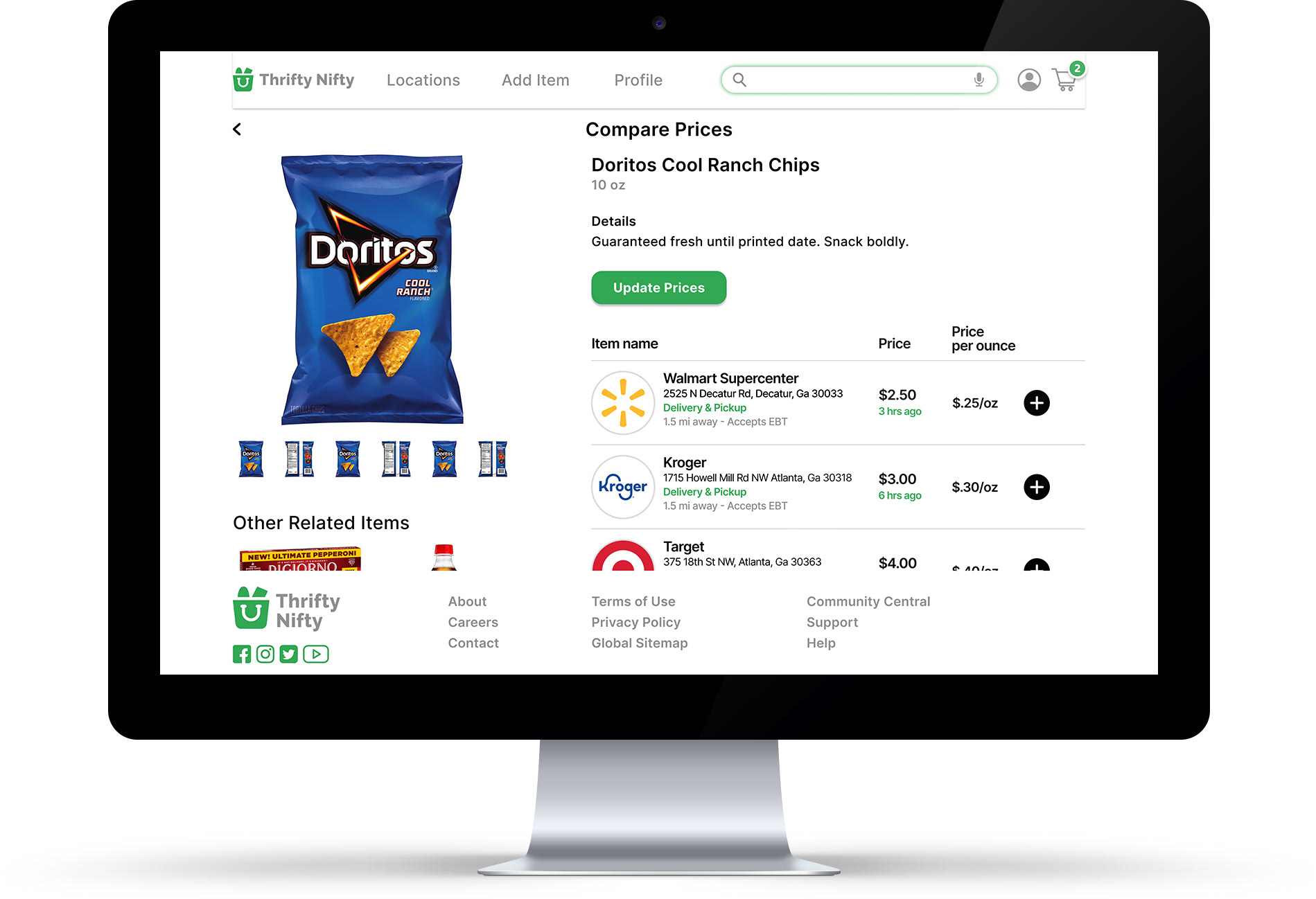
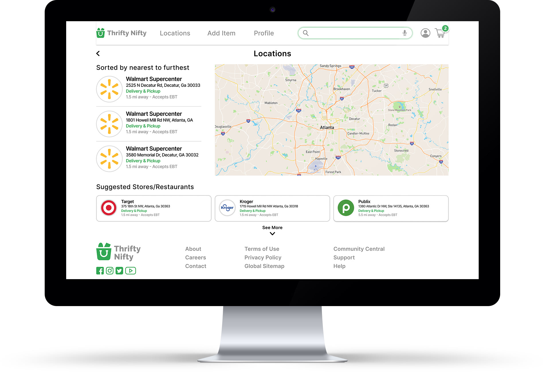
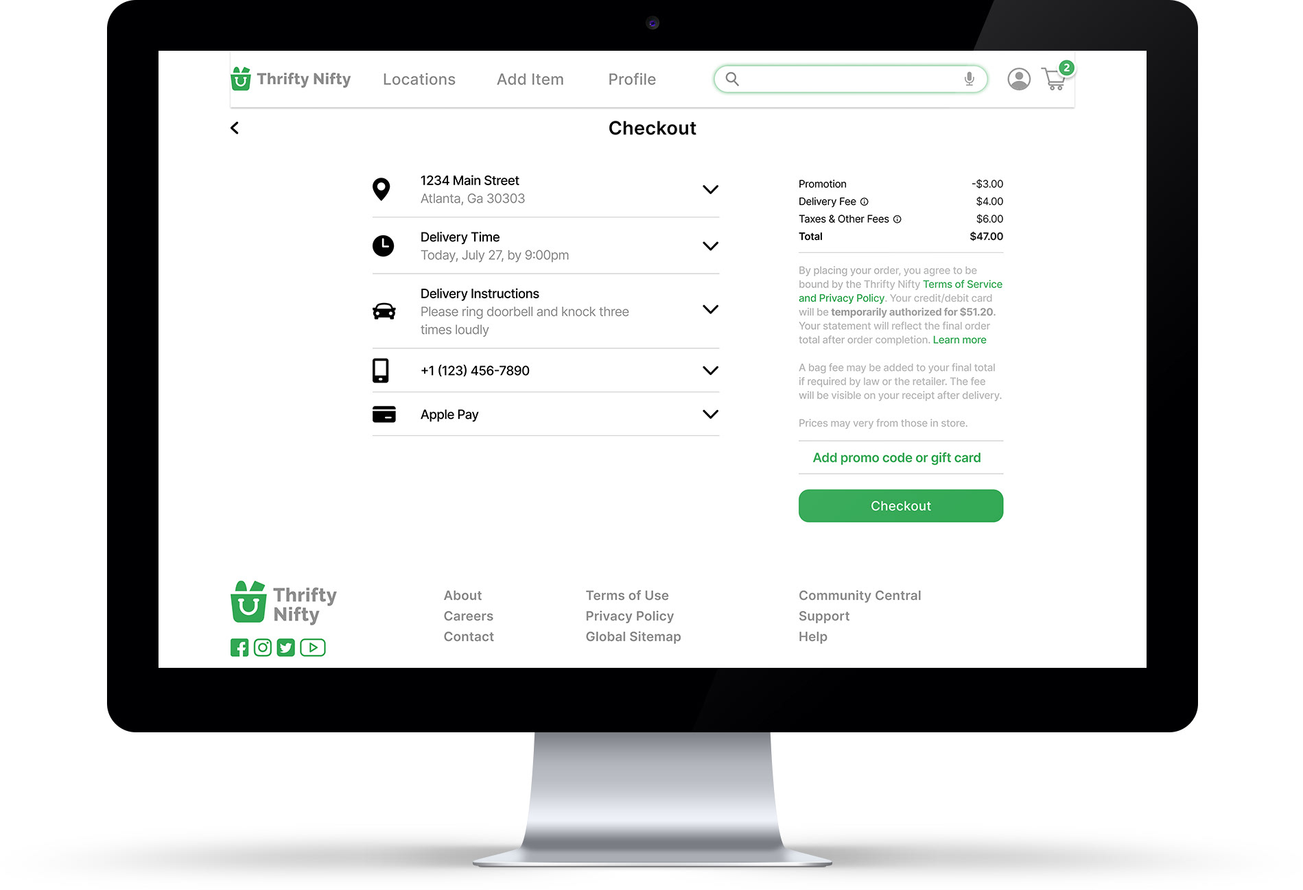
Desktop Site
Accessibility Considerations
•Implemented high contrast color palette for better readability and legibility
•Promoted cross-functionality with 3 in 1 product approach. Including Food delivery and pickup options.
•Implemented numerous features to increase accessibility and ensure an equitable experience for all users.
Takeaways
Impact:
This product should really help everyone maximize their grocery/restaurant savings as much as possible. And give them the financial freedom they need, as well as give them the upper hand on local price gouging.
What I learned:
The importance of accessibility and the benefits from taking it into consideration when designing any type of product. In this case, through extensive research I learned what additional features would best suit the end user, and enrich the experience for everyone.
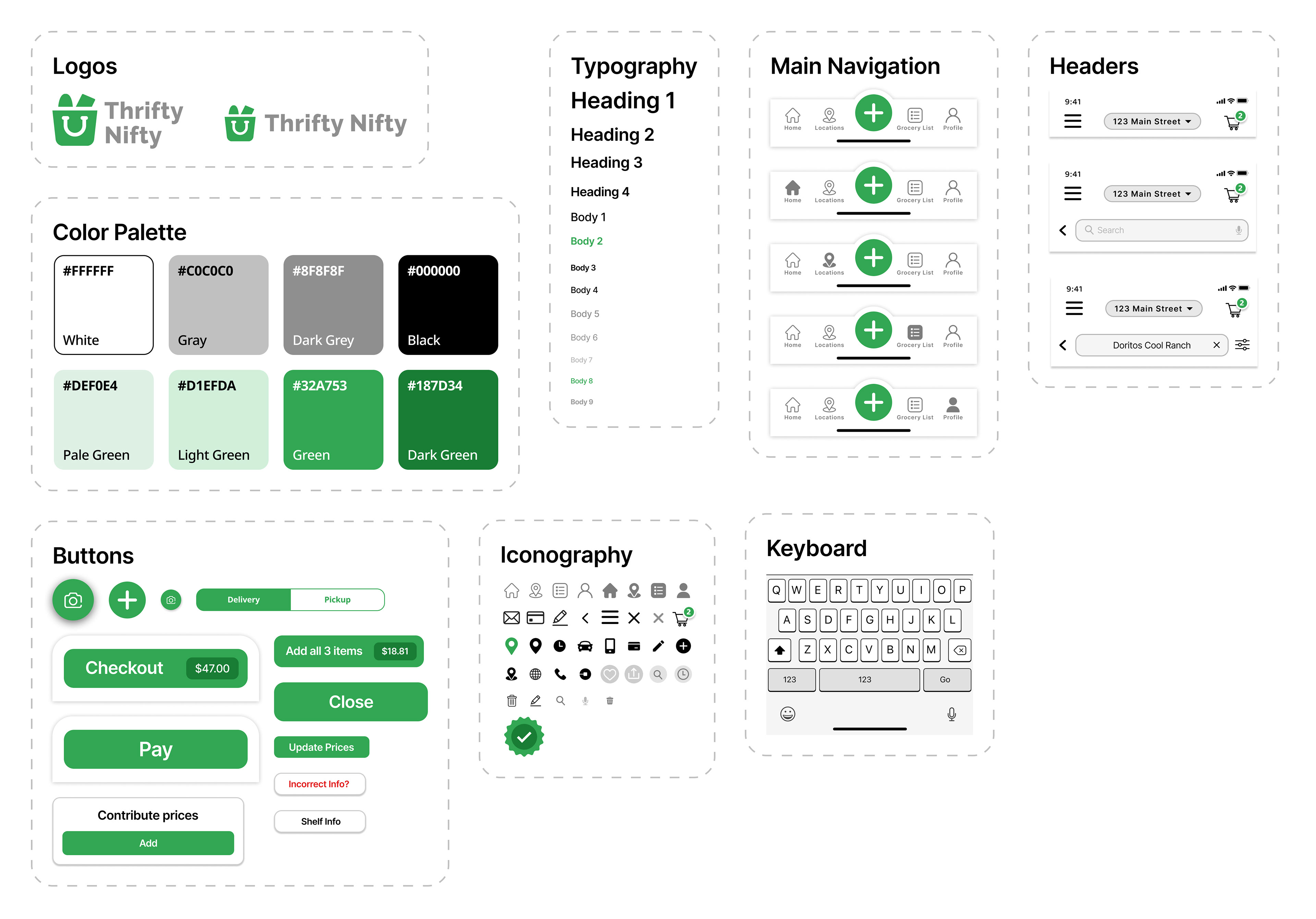
Design System